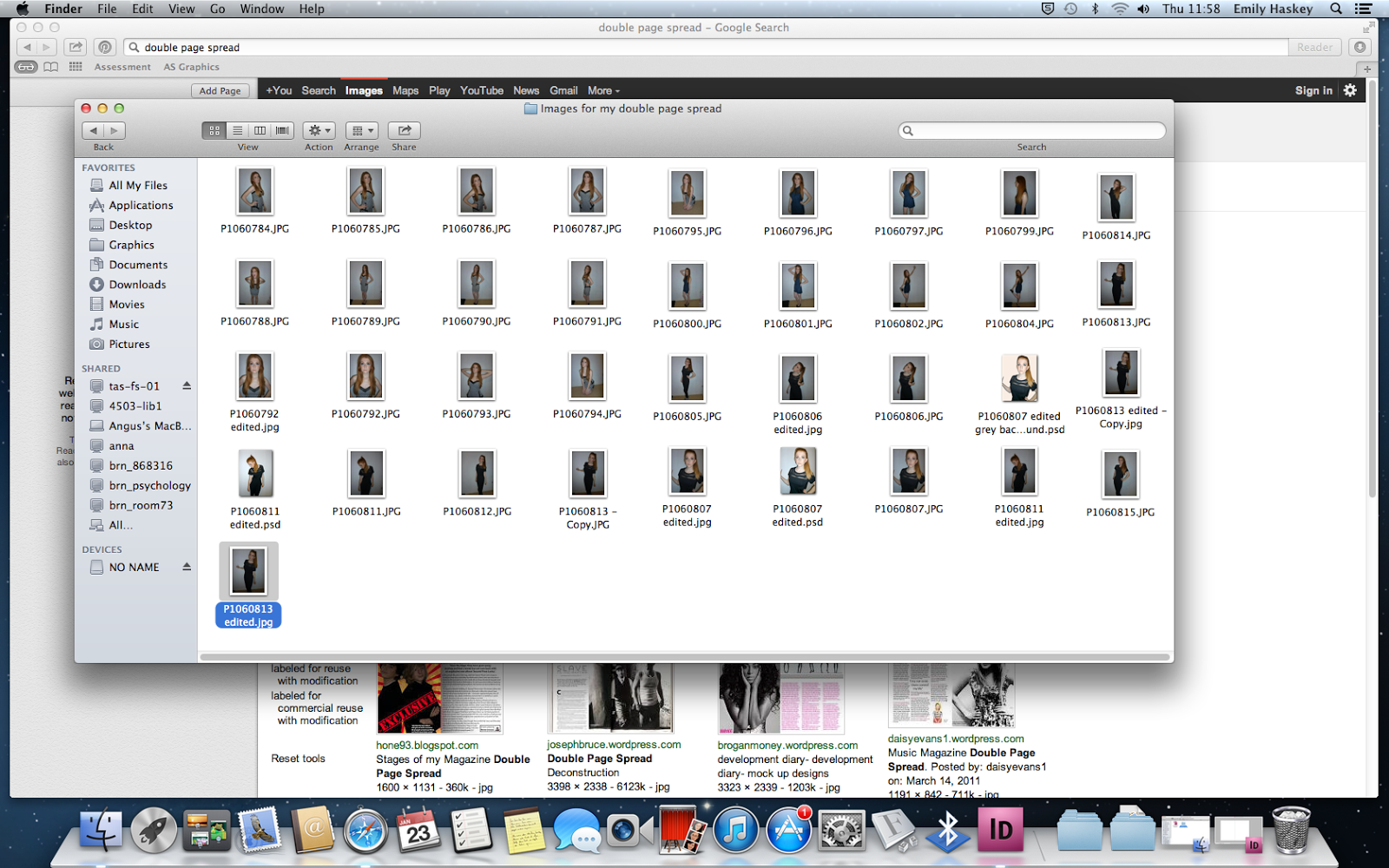
 I had taken a lot of images that I would use in my magazine cover and double page spread so I had a lot to choose from. When I chose a selection that I wanted to use in my double page spread, I edited them on a programme called iPiccy.
I edited her eye colour from a greyish blue to green because I thought it went really well with her hair colour.
I then thought that not adding any effects to the image might be a bit boring because I didn't have any effects on the image that is used on my front cover. So I experimented with a few effects.
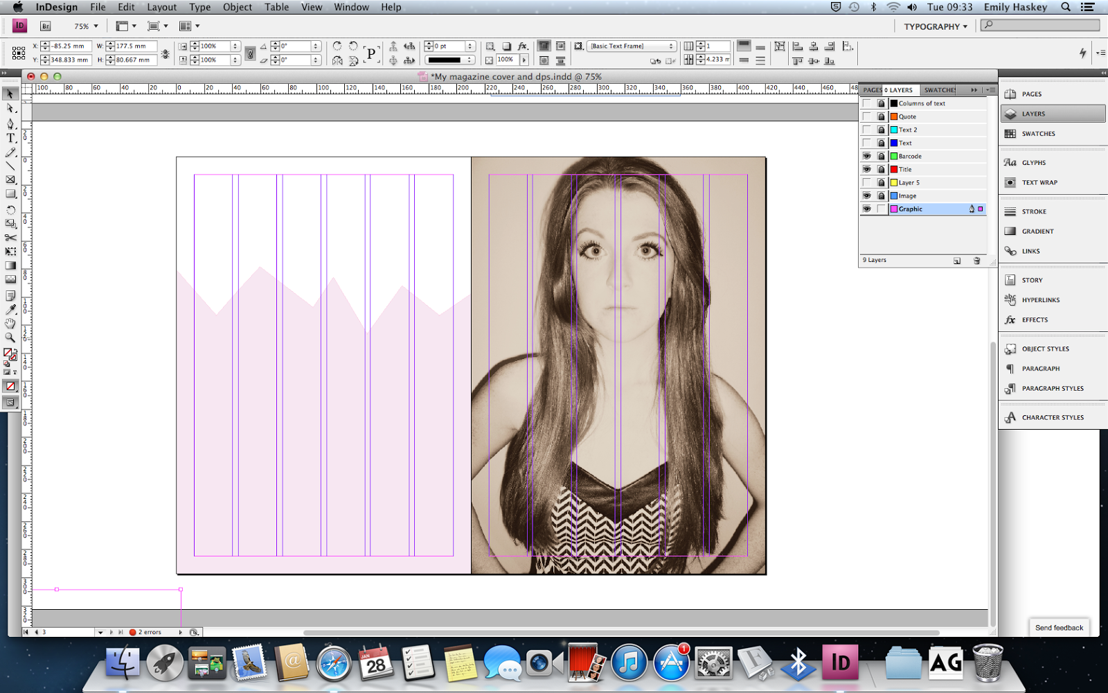
I finally decided to use the image that had the effect 'daguerrotype' because I thought it was quite subtle in contrast to the effect on the image I used for my cover page.
I then drew a shape using the pen tool on the left page and coloured it pink and altered the opacity.
I then added the header using two contrasting fonts, a script typeface and a sans serif typeface. Gills sans ultra bold and DearJoe 5 casual which I downloaded off dafont.
I then added two collumns of text (Loren Ipsum) keeping in line with my grid.
I placed my quote off centre of the page, because if I had everything in line with the grids it would be quite boring.
I realised that nothing stood out on the page and there were hardly any contrasts. So I altered this..
I changed the colour of my heading and the size to add more contrast and make it stand out more.
I also inserted a quote in between the two columns using the same typeface as the heading (as I didn't want to use too many different typefaces).
I copied the graphic that was on my left page and placed it over my picture on the right altering the opacity. This would make my pages link more.
I then made space for an image.
After choosing the image that I wanted to use I edited it on iPiccy using the same effect (daguerrotype) as I did on the right page of my double page spread.
I placed the edited image on my double page spread..
This is the final piece.


No comments:
Post a Comment