Friday, 11 April 2014
Thursday, 10 April 2014
My magazine cover
First I selected the image that I wanted to use and opened it in InDesign.
I then added a title using the font that I wanted which is Baskerville but I have adjusted the tracking, the vertical scale and the horizontal scale.
After that I added a barcode. I did it then instead of at the end because I knew I would've probably placed text there and then had to rearrange everything to make room for the barcode.
I then started playing around with different typefaces and text. Seeing where it would look best.
After playing around with text and images, this is what it looked like.
I found that the text was quite hard to read with the background that I had, so I decided to remove the background of the original image and just use a plain dark grey one. And I also didn't like some of the text that I was using so I also altered that.
This is what it then looked like, as you can see I changed some of the colours of the cover lines to give it a bit more contrast as it looked quite dull. However, I was still unhappy with the typeface that was in white so I decided to have a look at some different typefaces.
To add some contrast I looked for a thinner font that would contrast with the red, here the font I look at was Abadi MT condensed light. As you can see this typeface is much too thin for a front cover because the text doesn't stand out at all and is hard to read from a distance.
I then realised that having the grey background made the magazine cover look dull. So, using the eye dropper tool on photoshop I clicked on her face and used it as the colour of my background (after making it lighter). This made the front cover look much brighter.
I also had to change the colour of the text because the colour that it was clashed with the background colour. I also noticed that I hadn't left much margin space on the left either. So I moved the text to the right a bit and realised that because my text was in black and the model is wearing black I lost a lost of the text because it was difficult to read.
This is the completed magazine cover.
Wednesday, 9 April 2014
My magazine double page spread
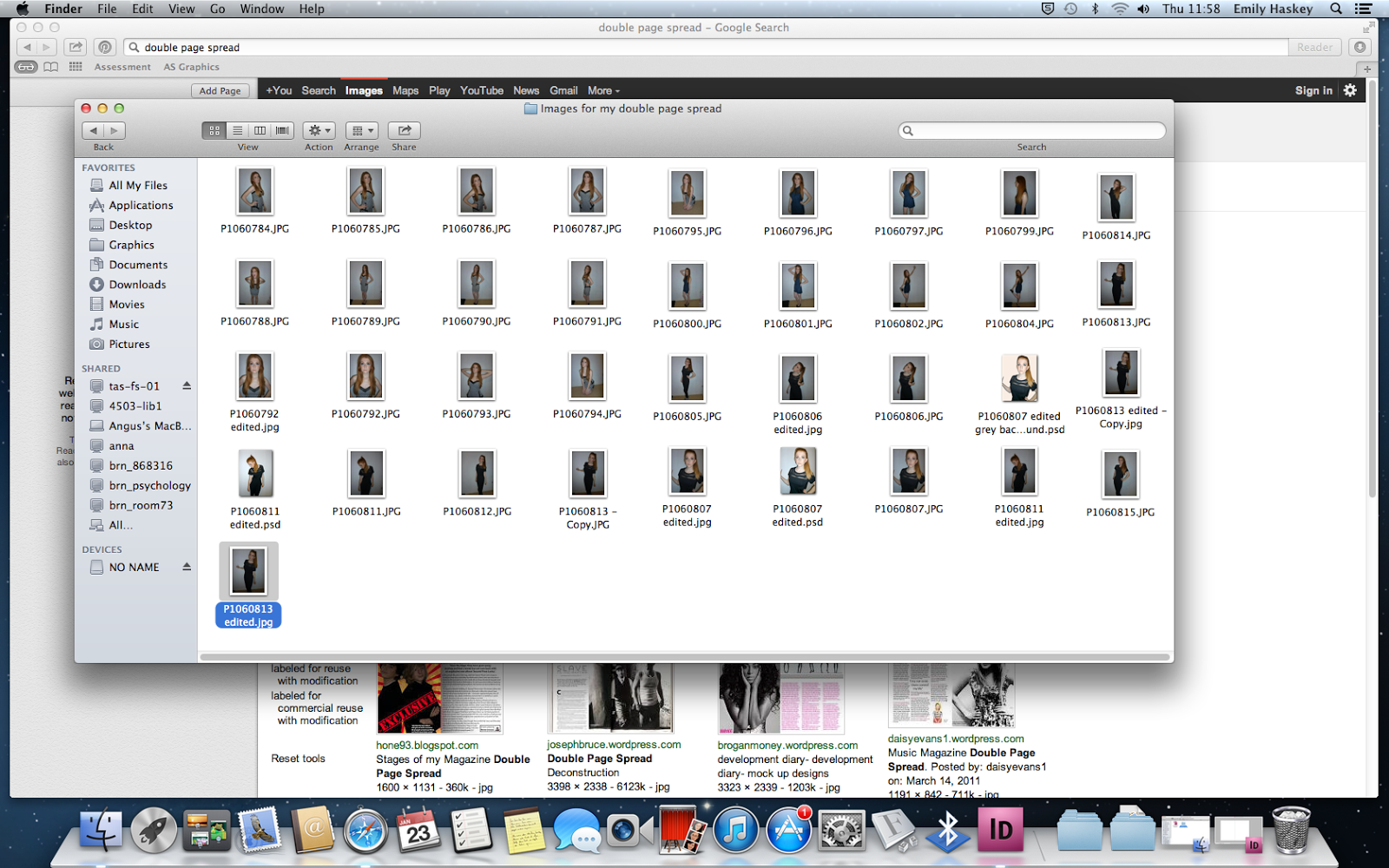
 I had taken a lot of images that I would use in my magazine cover and double page spread so I had a lot to choose from. When I chose a selection that I wanted to use in my double page spread, I edited them on a programme called iPiccy.
I edited her eye colour from a greyish blue to green because I thought it went really well with her hair colour.
I then thought that not adding any effects to the image might be a bit boring because I didn't have any effects on the image that is used on my front cover. So I experimented with a few effects.
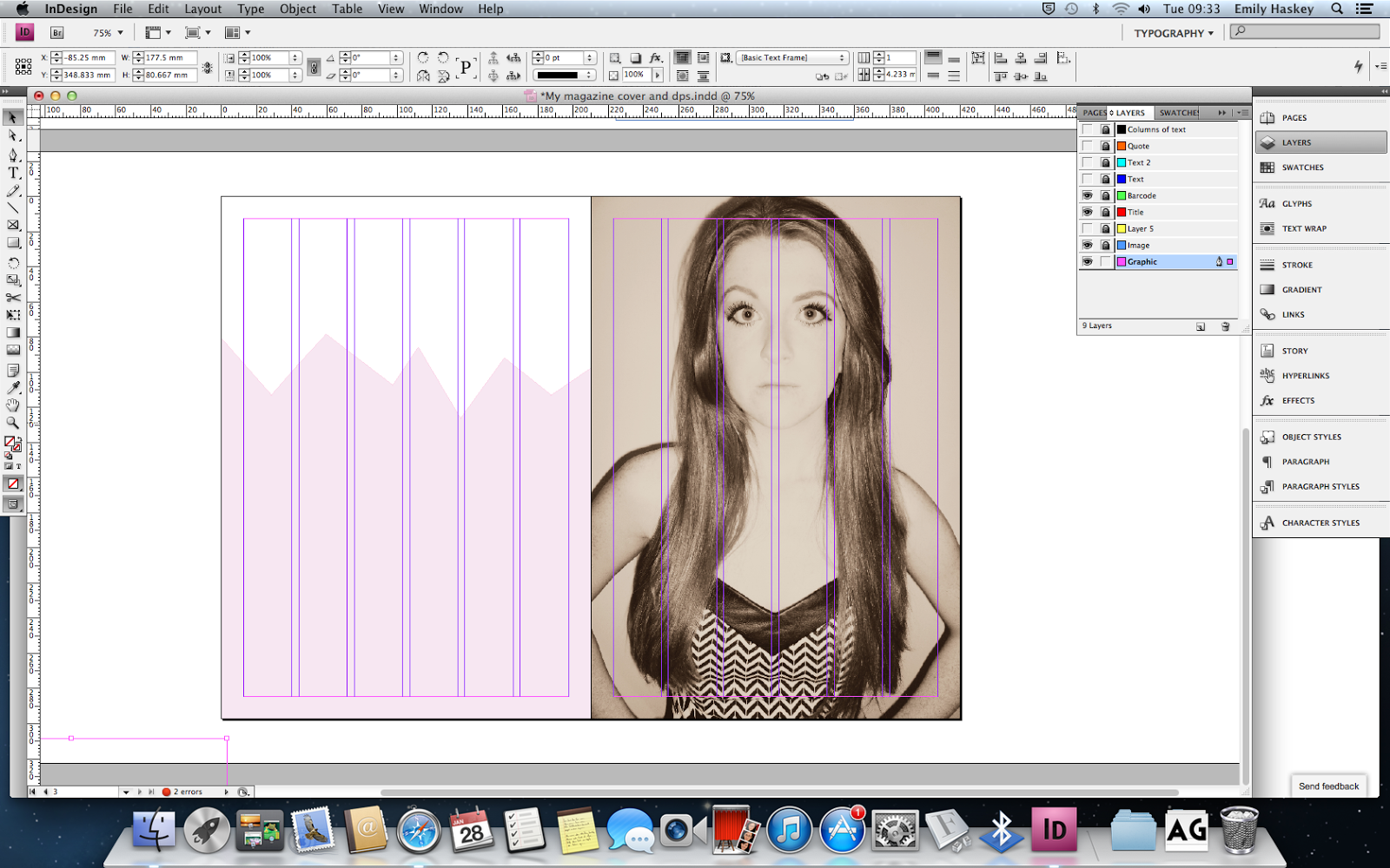
I finally decided to use the image that had the effect 'daguerrotype' because I thought it was quite subtle in contrast to the effect on the image I used for my cover page.
I then drew a shape using the pen tool on the left page and coloured it pink and altered the opacity.
I then added the header using two contrasting fonts, a script typeface and a sans serif typeface. Gills sans ultra bold and DearJoe 5 casual which I downloaded off dafont.
I then added two collumns of text (Loren Ipsum) keeping in line with my grid.
I placed my quote off centre of the page, because if I had everything in line with the grids it would be quite boring.
I realised that nothing stood out on the page and there were hardly any contrasts. So I altered this..
I changed the colour of my heading and the size to add more contrast and make it stand out more.
I also inserted a quote in between the two columns using the same typeface as the heading (as I didn't want to use too many different typefaces).
I copied the graphic that was on my left page and placed it over my picture on the right altering the opacity. This would make my pages link more.
I then made space for an image.
After choosing the image that I wanted to use I edited it on iPiccy using the same effect (daguerrotype) as I did on the right page of my double page spread.
I placed the edited image on my double page spread..
This is the final piece.
Thursday, 3 April 2014
Cover draft
Here is my cover draft, I decided on a serif typeface for the title 'ENVY' and decided to place nearly all of my text on the left so it would looked balanced with the photo on the right.
Subscribe to:
Comments (Atom)


